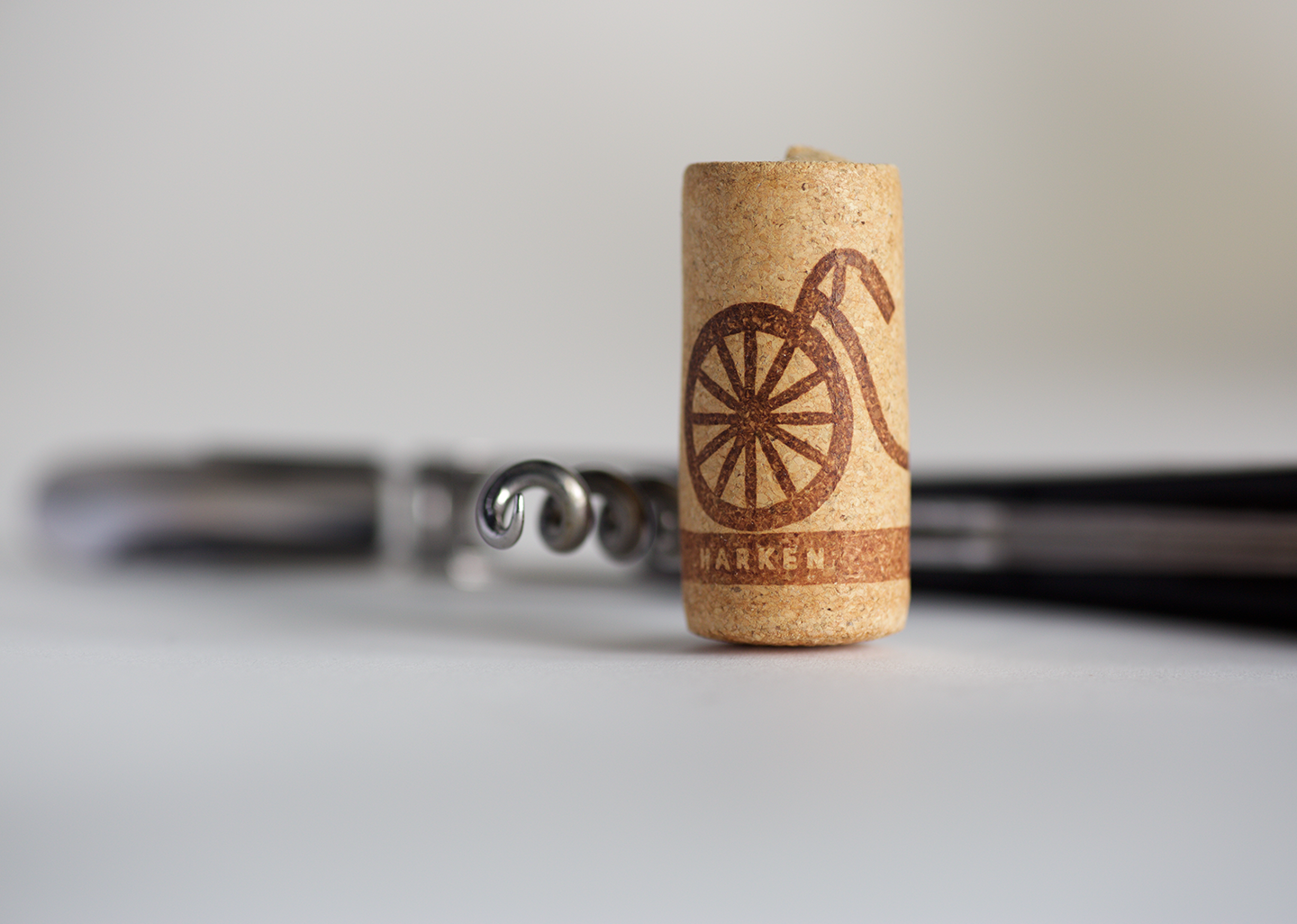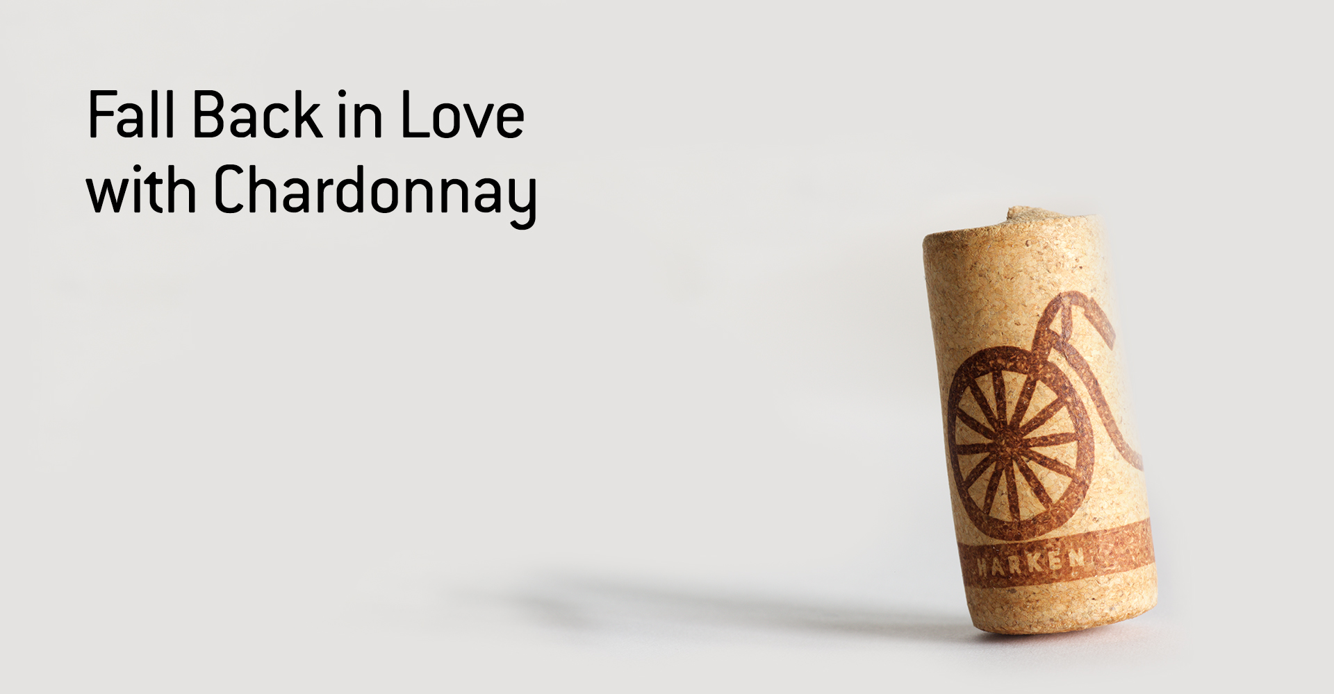
HARKEN
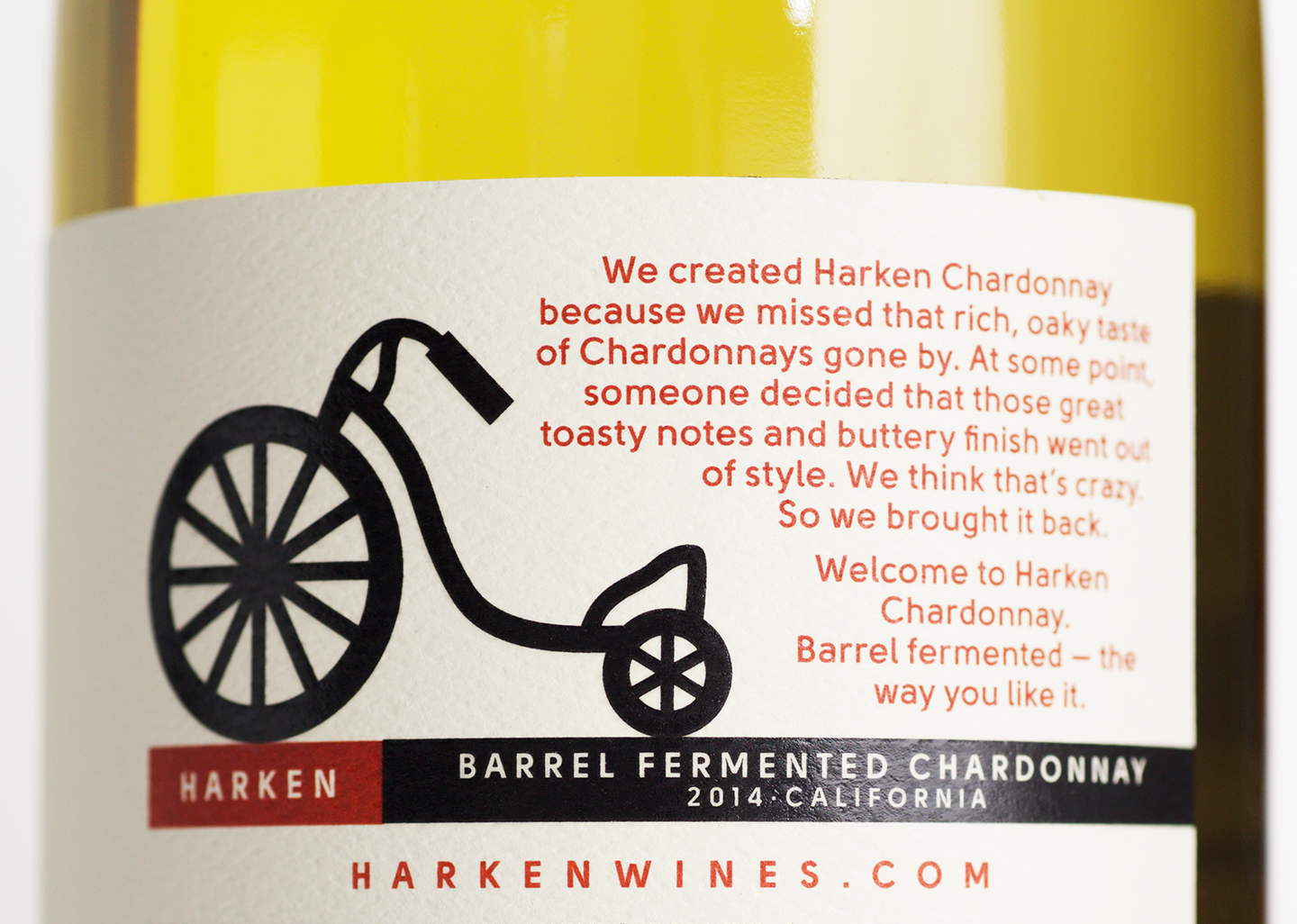
Great taste should never go out of style. That’s why we worked with O’Neill Vintners to introduce a new generation to toasty, buttery, barrel-fermented Chardonnay.
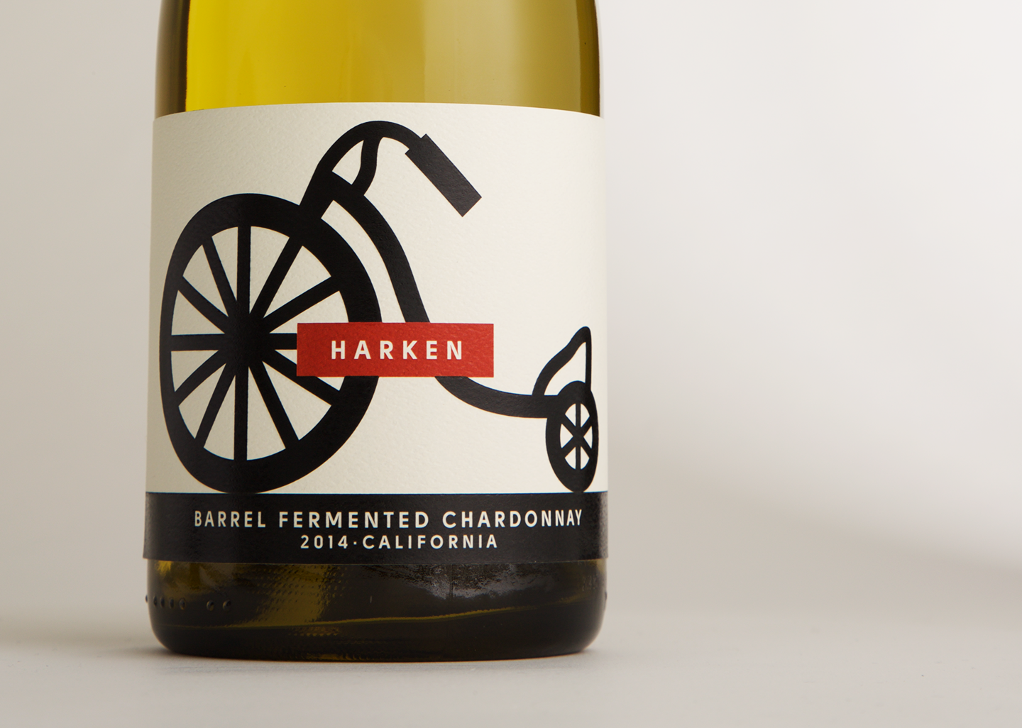
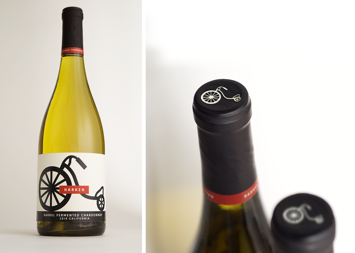
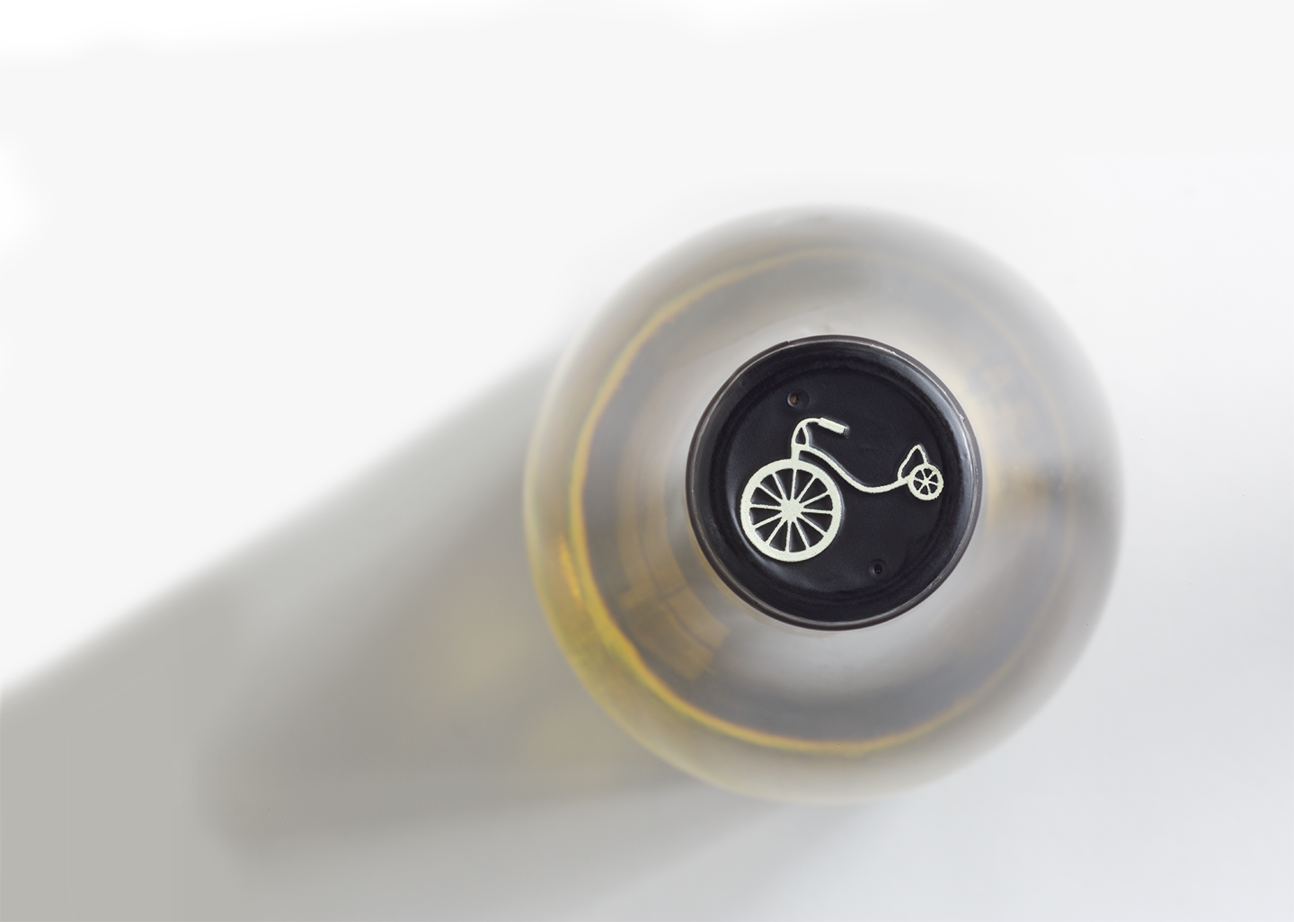
Starting with only a delicious wine in a barrel, we developed a strategy, name, identity, and packaging that celebrates what’s old can be new. The Harken name and trike icon have a modern feel but evoke a playful nostalgia that asks current, lapsed, and new chardonnay fans to fall in love with their wine again.
From the name to case design to guidelines, we created a brand system that stands out with the trade and wins on shelf with shoppers. It’s a wine and a brand that that has proven to be easy to fall in love with.
We thought it was crazy that wine this good went out of style, so we helped bring it back.