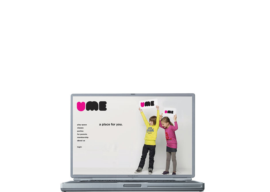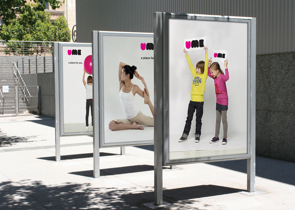
UME
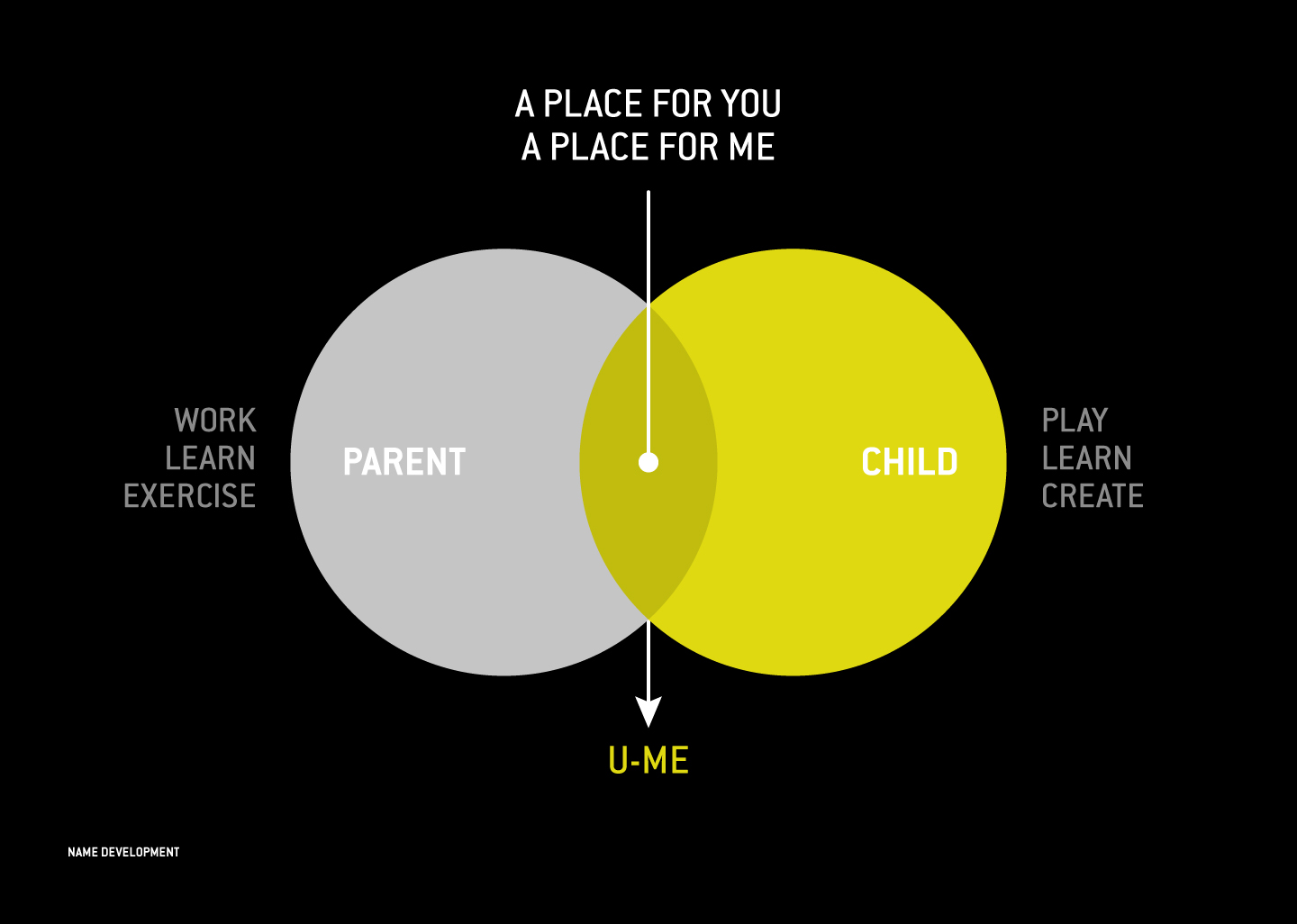
U-Me offers a unique space where the whole family can play, learn, exercise, and socialize in a safe, comfortable environment. When they asked us to develop their identity as the leader in the emerging category of “family destination,” we knew that we would need to draw the attention of both parents and children. Our strategy focused on the brand’s promise of “fresh fun for the whole family,” connecting the ideas of social hub with family retreat.
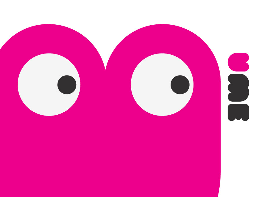
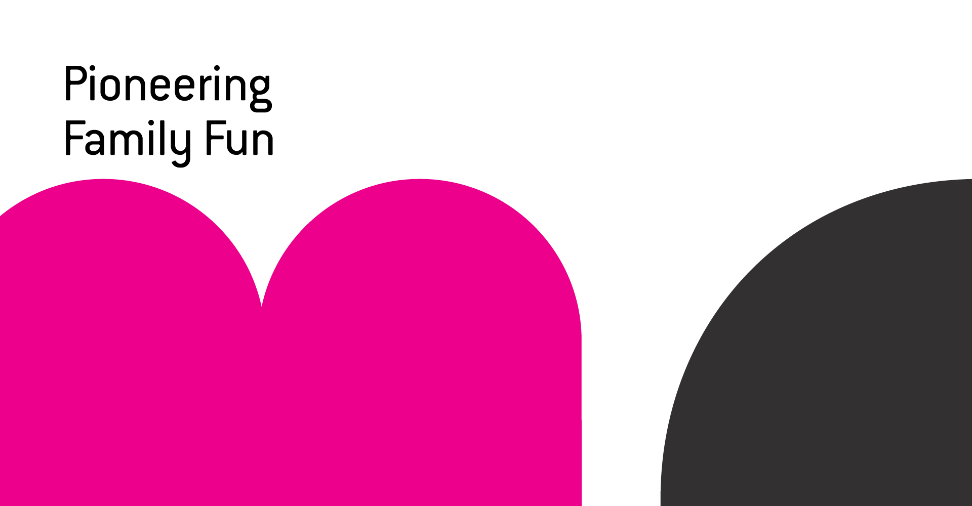
To meet our design challenge, we balanced and blended fun with modern, minimalist with vibrant, and youthful with sophisticated. Letting “fresh” be the guiding concept, our color palette juxtaposes clean black and white with a pop of color. The logo’s letterform design is “big and squishy,” which, while child-friendly, is also refined. As an important “third space” tailored equally to the needs kids and parents, U-Me pioneers family togetherness in a fresh, fun new way.