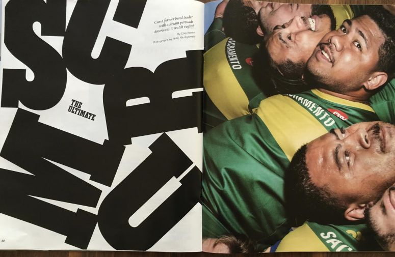
PRO Rugby profiled in New York Times Magazine
First, he needed a name and a logo. He couldn’t use the word “league” because “rugby league” signified a much less popular version of the game that developed after the so-called Great Schism of 1895, when working-class players from northern England who wanted to be paid split off from teams adhering to the supposed purity of amateur competition. A branding firm in San Francisco proposed a number of logos and names.
Some, like the National Rugby Association, or N.R.A., were red carded for unwanted connotations. Logos that looked decent on a ball or jersey might look crummy on a trailer or a pitch. He finally settled on a red oval shaped like a rugby ball with the winning name in block letters: PRO, for Professional Rugby Organization. He added the word “Rugby” below the acronym lest there be any confusion about what PRO actually stood for.


