Kvarøy Arctic
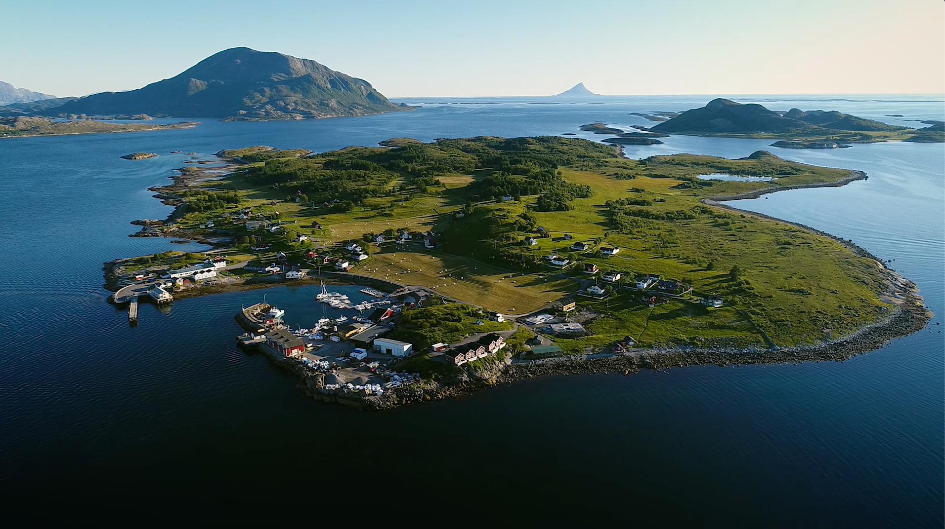
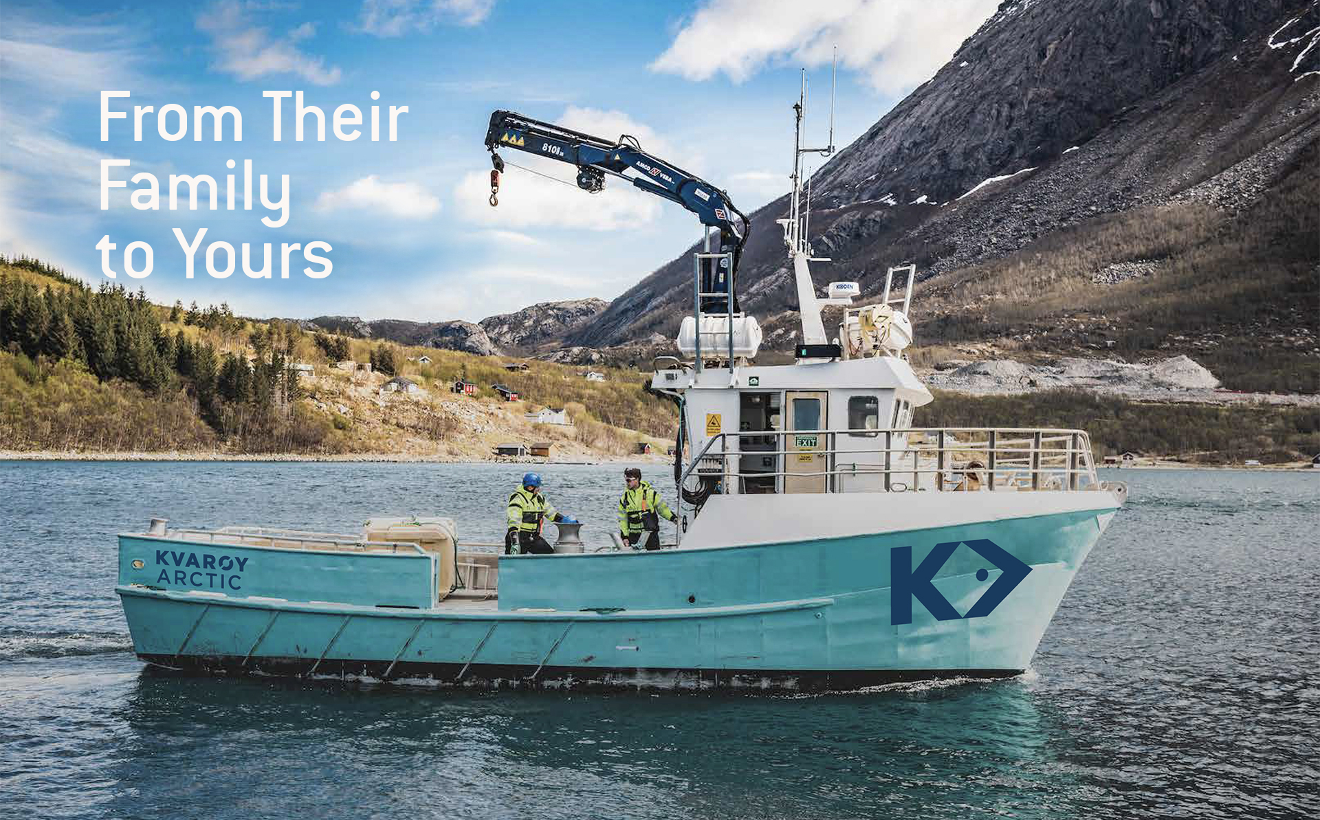
Kvarøy (say, Kwa-ray) is an island on the Arctic Circle, just off the Norwegian coast. It is also the home of a third-generation family business that continues its quest to raise the healthiest, tastiest, most sustainable salmon possible.
We were honored to be contacted to create and launch a farmed salmon brand in the U.S. They had a name, Kvarøy Fiskeoppdrett (which translates to “Fish Farming in Kvarøy”), and a wordmark set in a distinctive seafoam green – the same color they painted their fleet of boats.
We started by revising the name to “Kvarøy Arctic” to include a meaningful and memorable location reference for U.S. consumers. The logo we developed retains their heritage color while boldly communicating the progressiveness of their industry-leading sustainability practices by combining an iconic K with the forward-pointing “greater than” symbol to create an abstract depiction of a salmon.
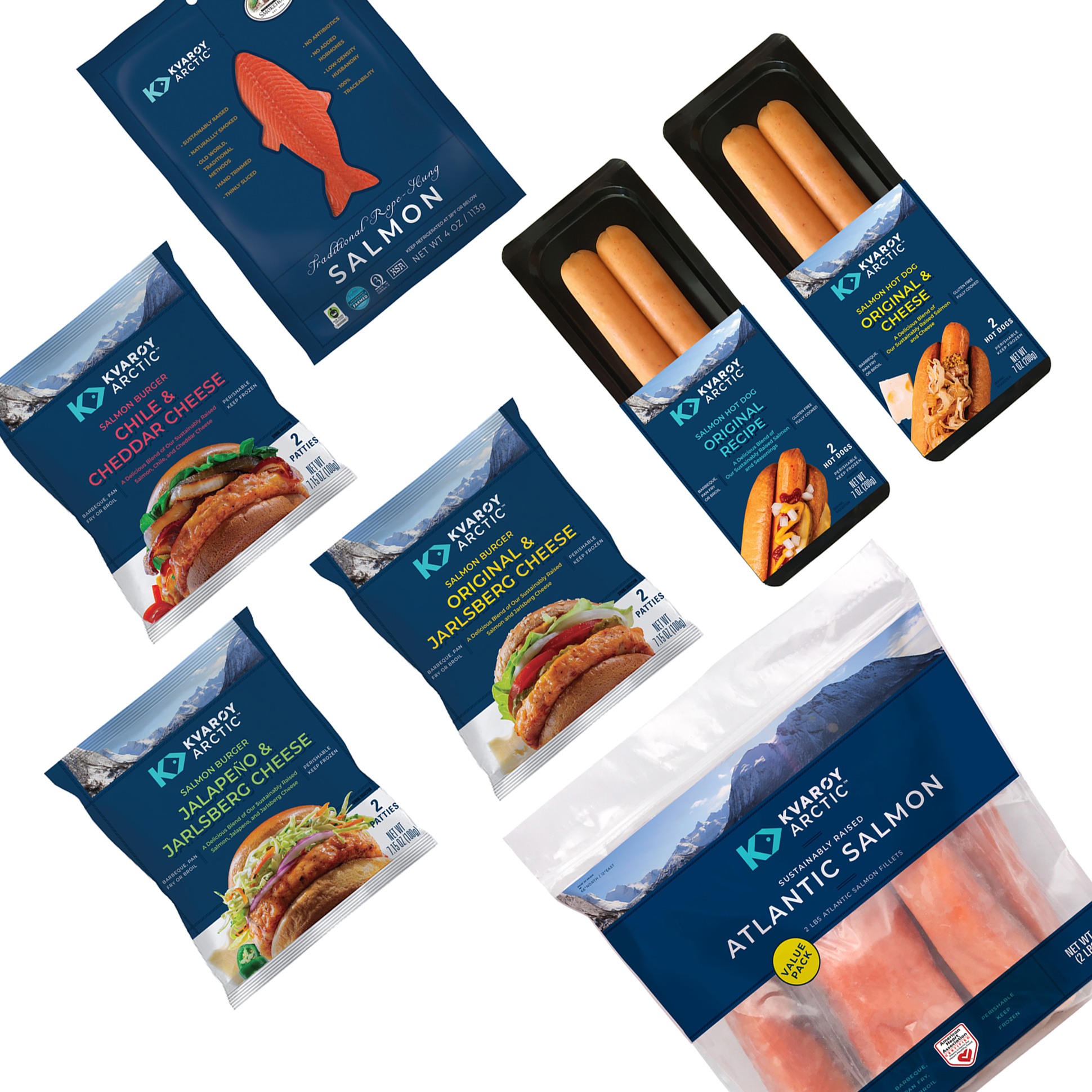
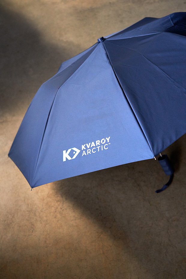
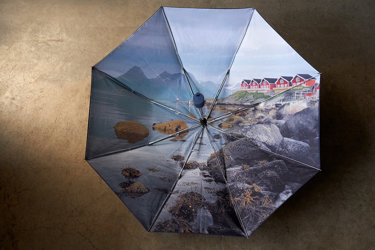
To introduce the people, place, and purpose behind their products, we drafted a comprehensive white paper, which also served as the foundation for the website we developed. The sales materials, branded merchandise, and package design create a cohesive presence, inviting retail stores and their customers to join Kvarøy Arctic in their pursuit to raise healthy, delicious salmon without impacting our environment.
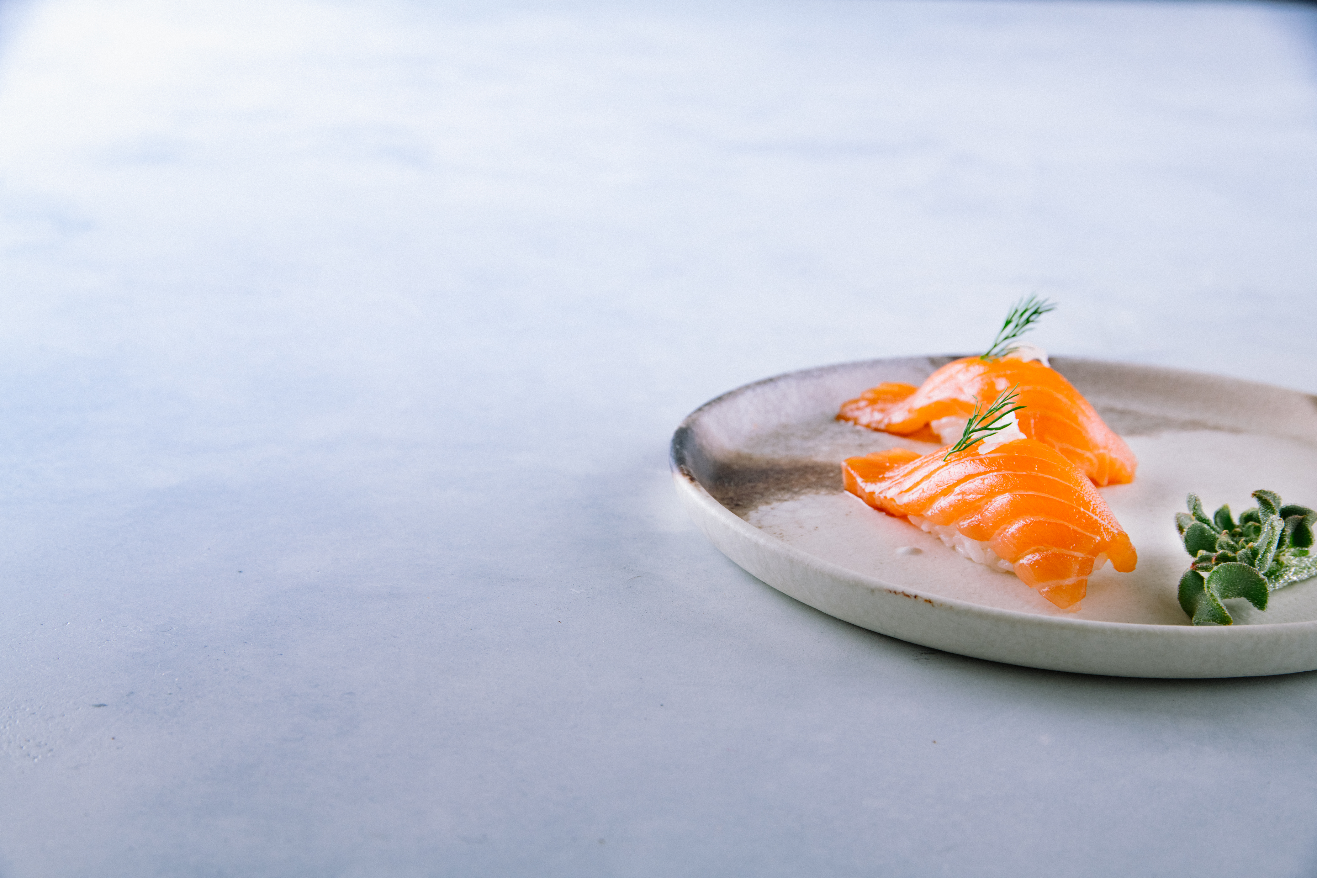
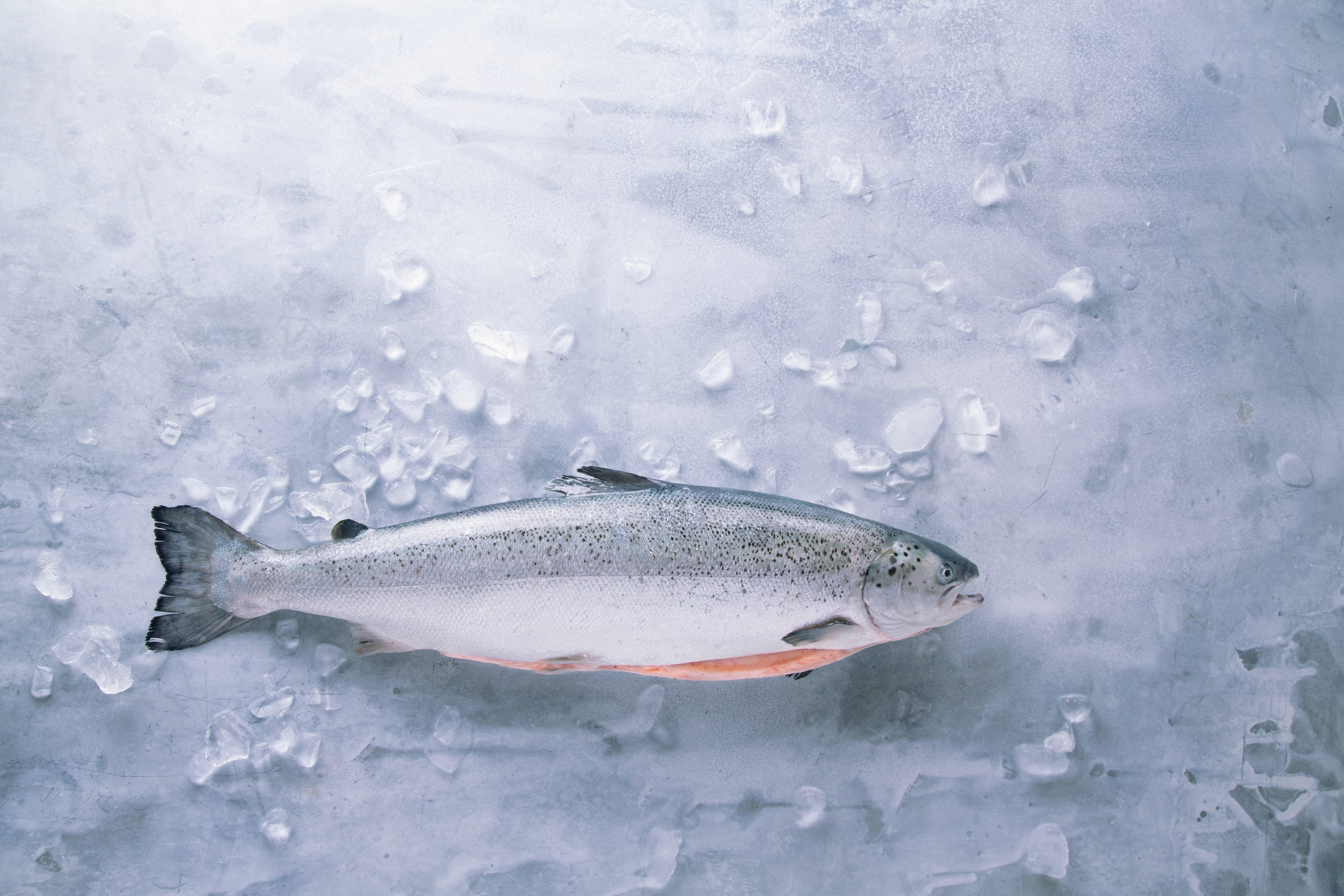
For the creation of the package design and sales materials we partnered with James Beard award-winning photographer Eric Wolfinger to ensure the salmon’s fresh, delicious taste was always front and center.