Professional Rugby Organization
The founder of North America’s first professional rugby league was interested in starting the league not because he was a passionate former player, but rather a fan of the sport’s values that he felt are no longer present in today’s NFL, NBA, NHL and MLB, “Lots of people feel pro sports used to be a great influence – it built character and provided role models – but not so much now. I believe we can go back to the days of athletes behaving professionally.”
It was this vision, plus the desire to have a memorable handle that was different from the “alphabet soup” of other sports leagues that provided our direction for the naming of the league. Our strategy for the name frames the brand in the simplest, most direct manner: PRO Rugby, with “PRO” as the acronym for Professional Rugby Organization.
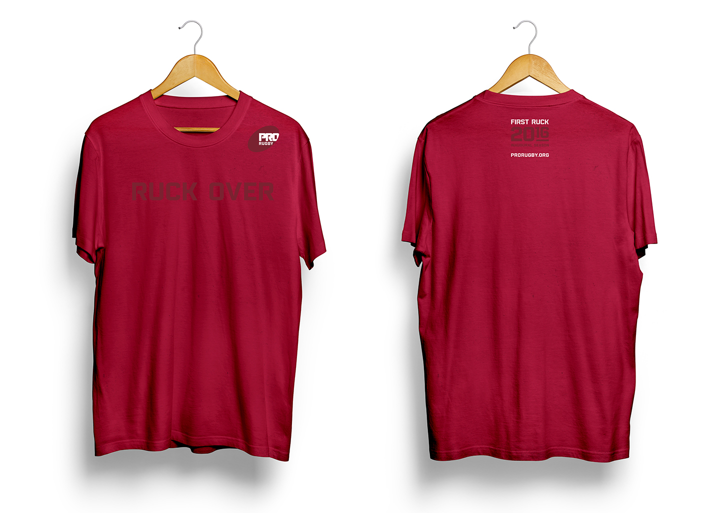
For the identity we chose a rich red, prominent in both the US and Canada national colors to represent the league’s geography. The forward-leaning rugby ball shape reflects the excitement and speed of the game; while interlocking typography conveys the required teamwork and resulting strength when individuals band together for a common goal.
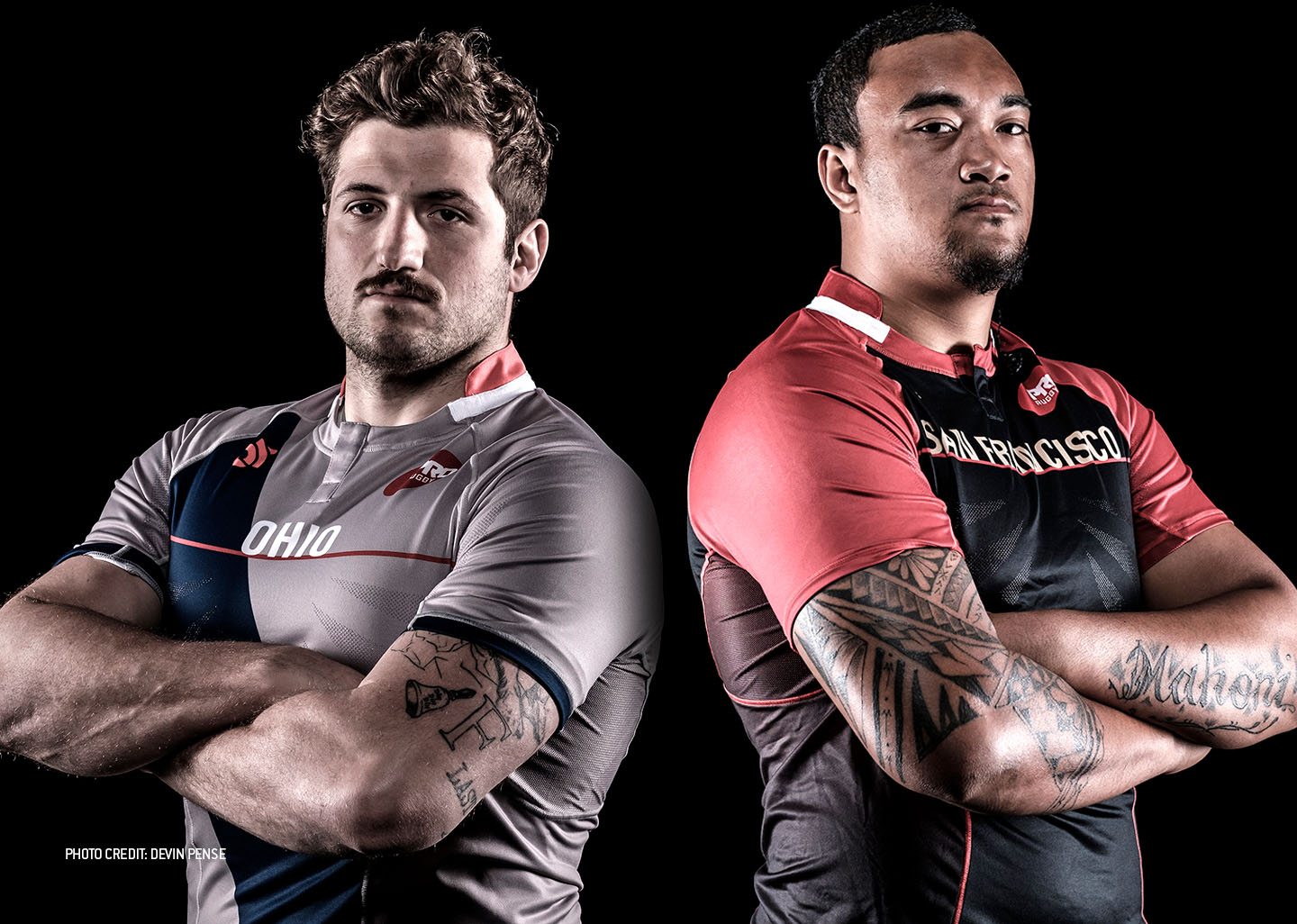
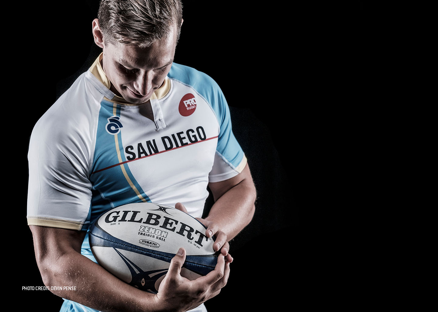
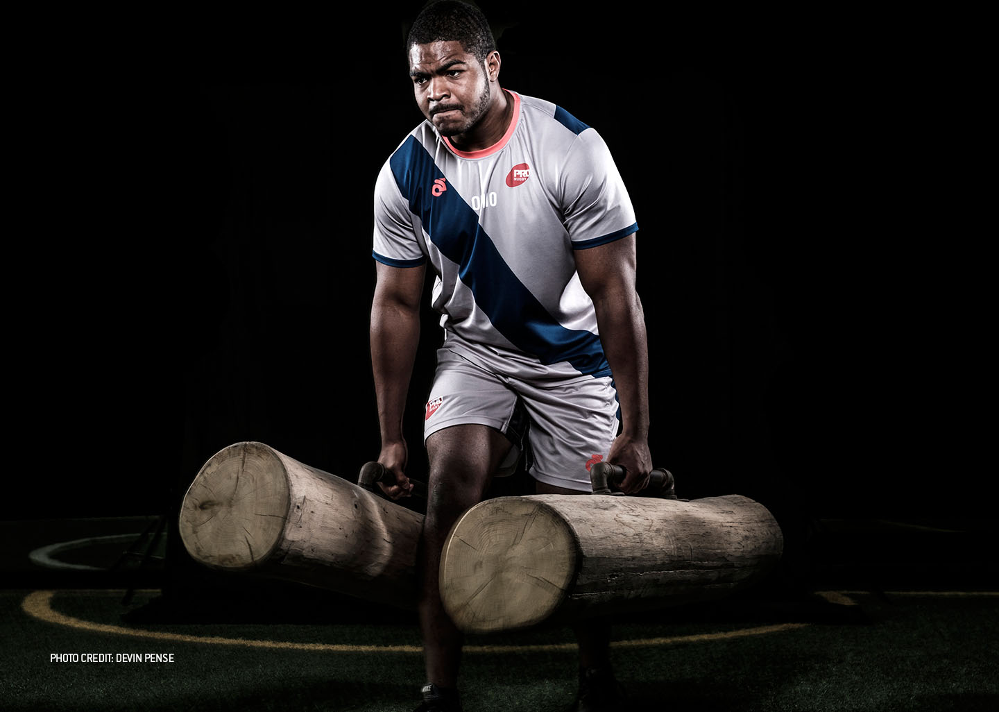
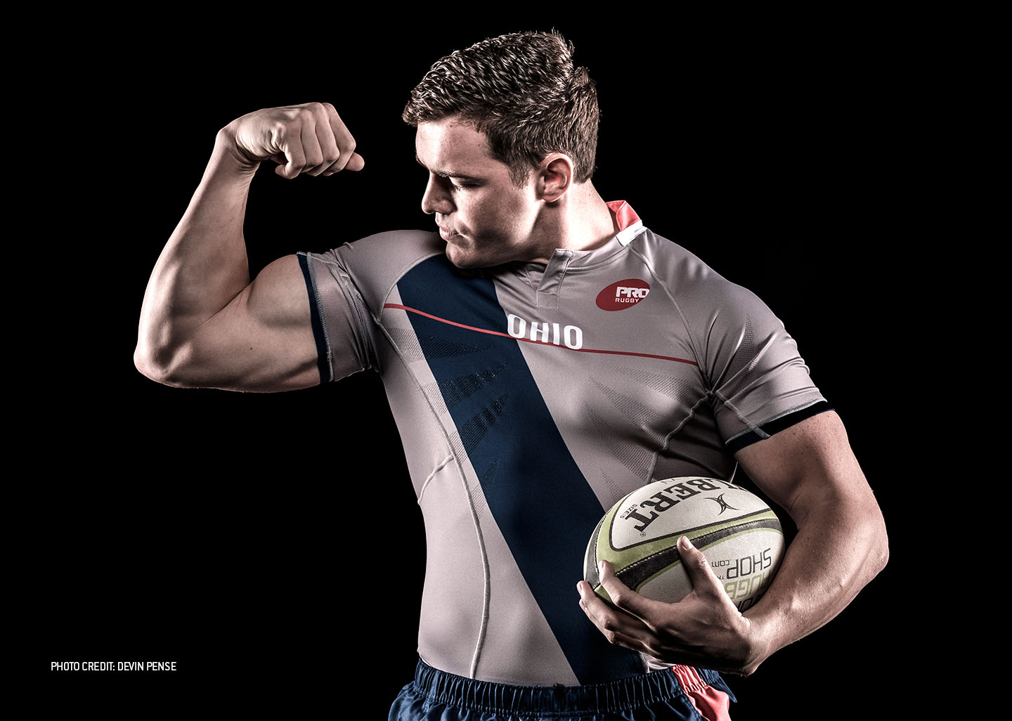
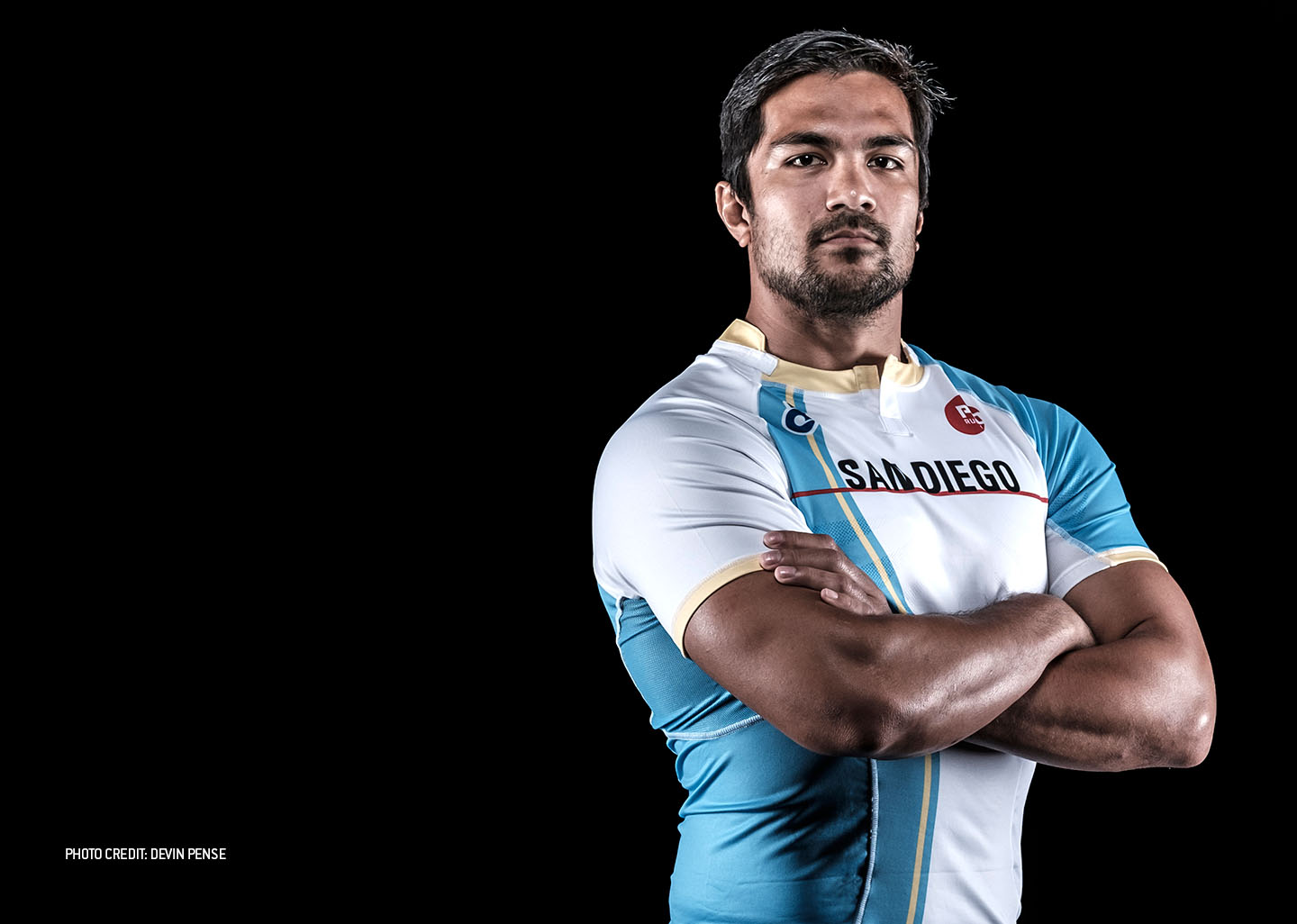
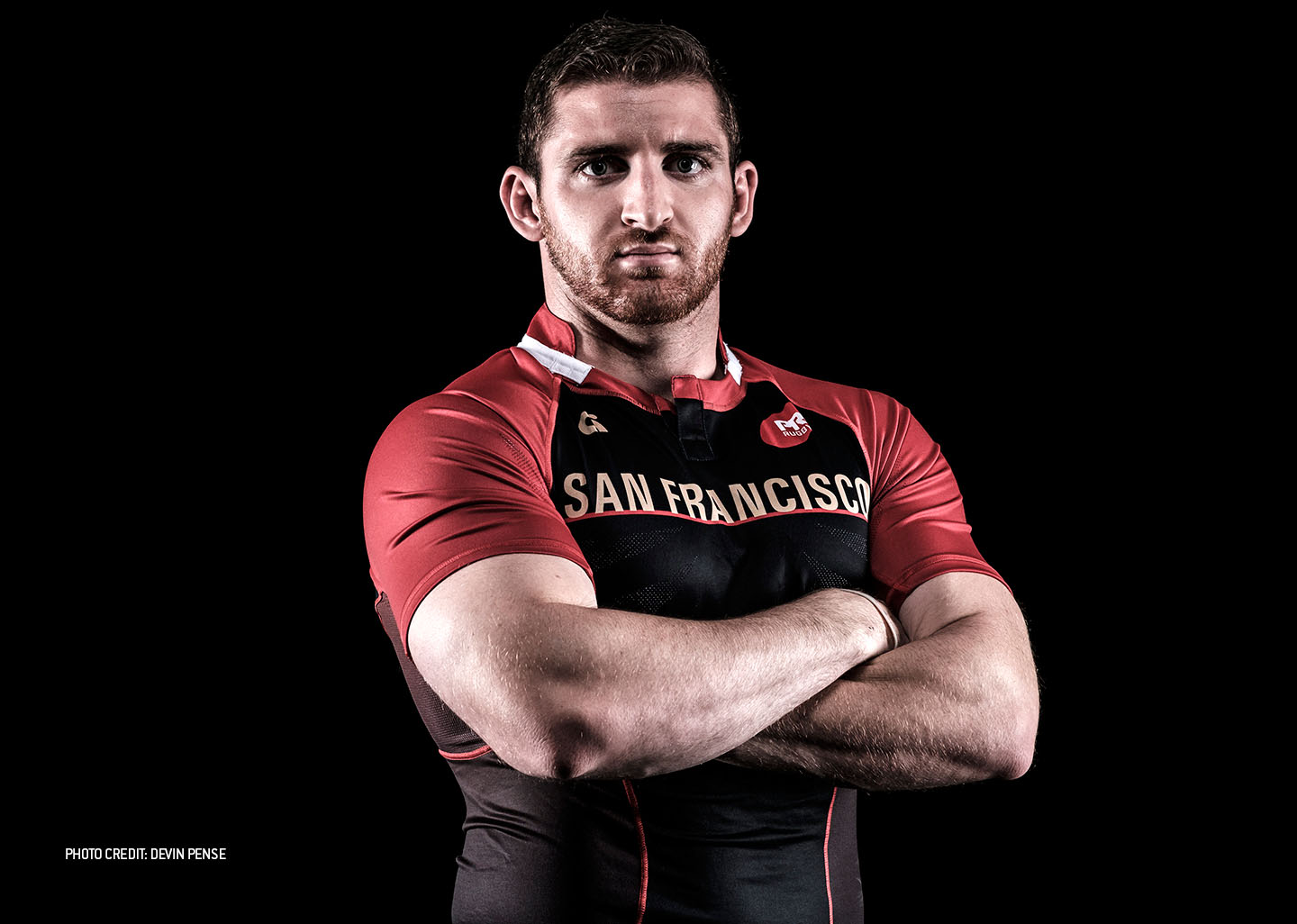
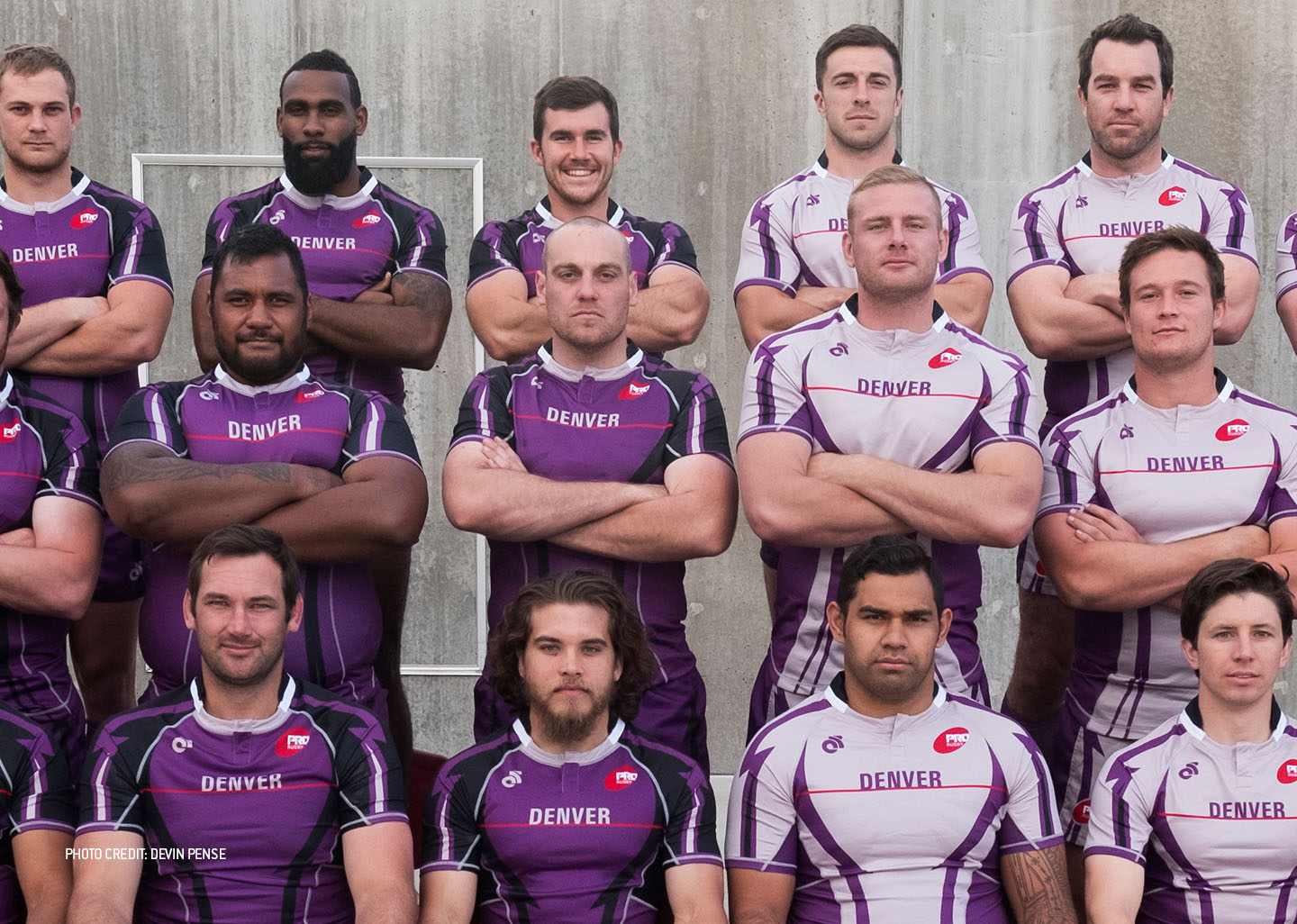
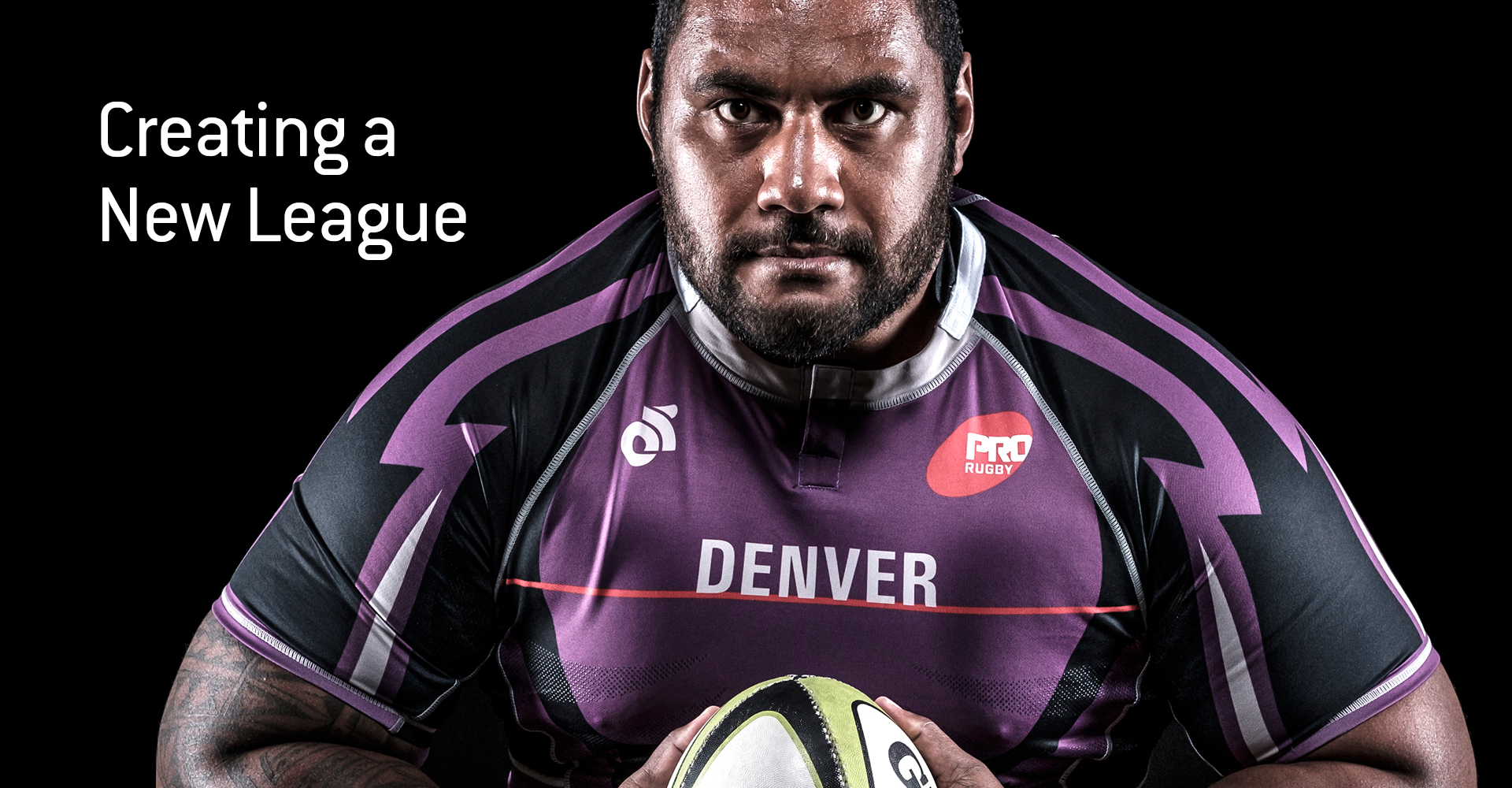
For the inaugural teams’ uniforms we chose simple bold patterns, and color palettes that fit within each team’s current sports landscapes. One element of innovation we incorporated was a thin PRO Rugby red line that horizontally crosses the chest to assist the referee in determining high tackles. The governing body of World Rugby is hoping that this is just the first of many future PRO Rugby innovations that shape the game globally as the league grows.
