Alvarado Street Bakery
Alvarado Street Bakery is a worker-owned cooperative that has been baking delicious whole wheat breads in Sonoma County for over 35 years. They contacted us to help them increase brand awareness and recall, as competitors were increasing their market share.
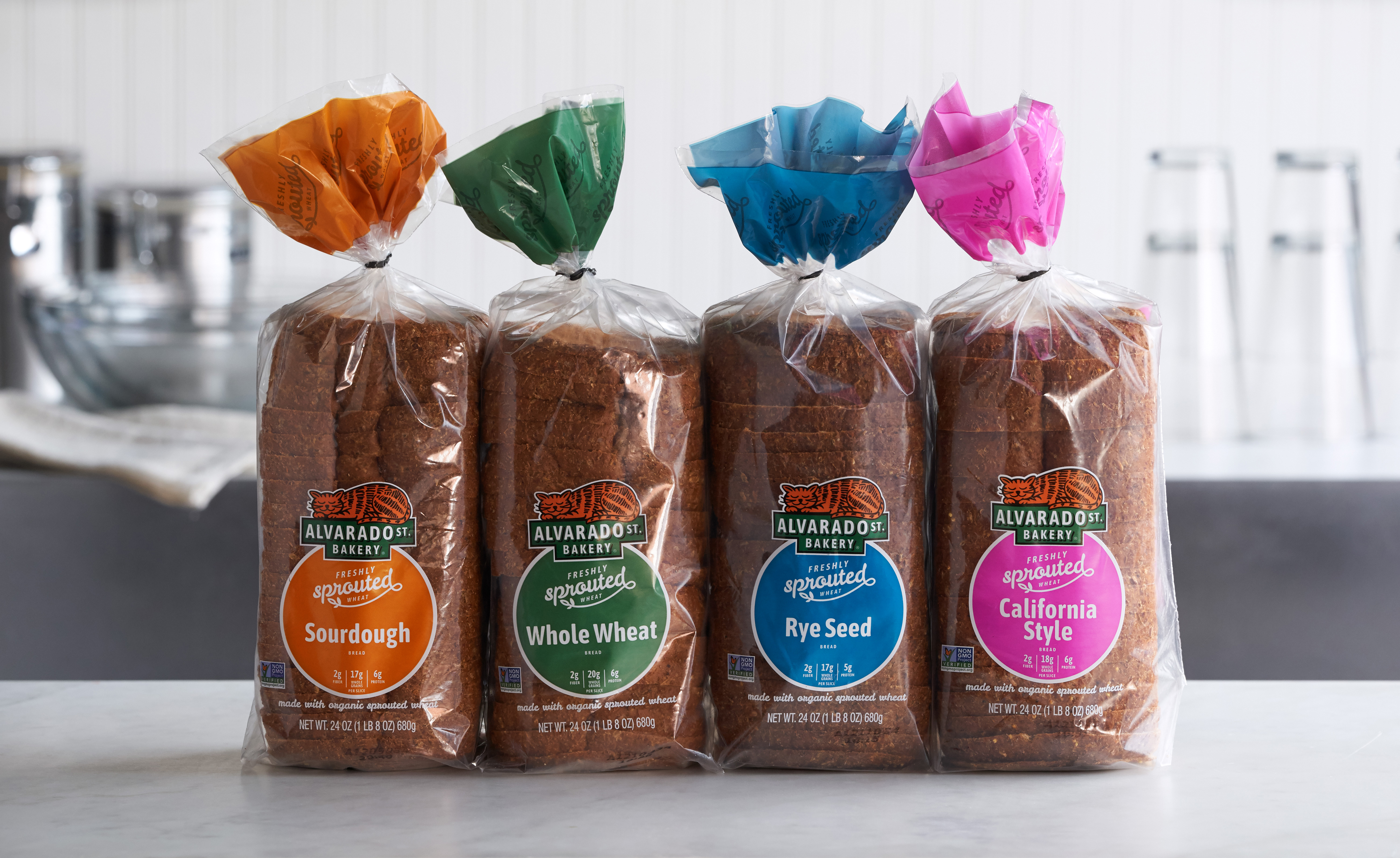
Historically, Alvarado Street Bakery’s retail presence has served as their entire marketing program, so it was critical that their packaging clearly communicate who they are and how they differ from other whole wheat bread brands. We recognized a fundamental flaw, however, in their current packaging. The communication for a category generic ingredient, “sprouted wheat,” was overshadowing their Alvarado Street Bakery identity. We later learned that even loyal purchasers of the brand weren’t able to recall the brand – just “sprouted” and the specific color of the packaging for their favorite bread.
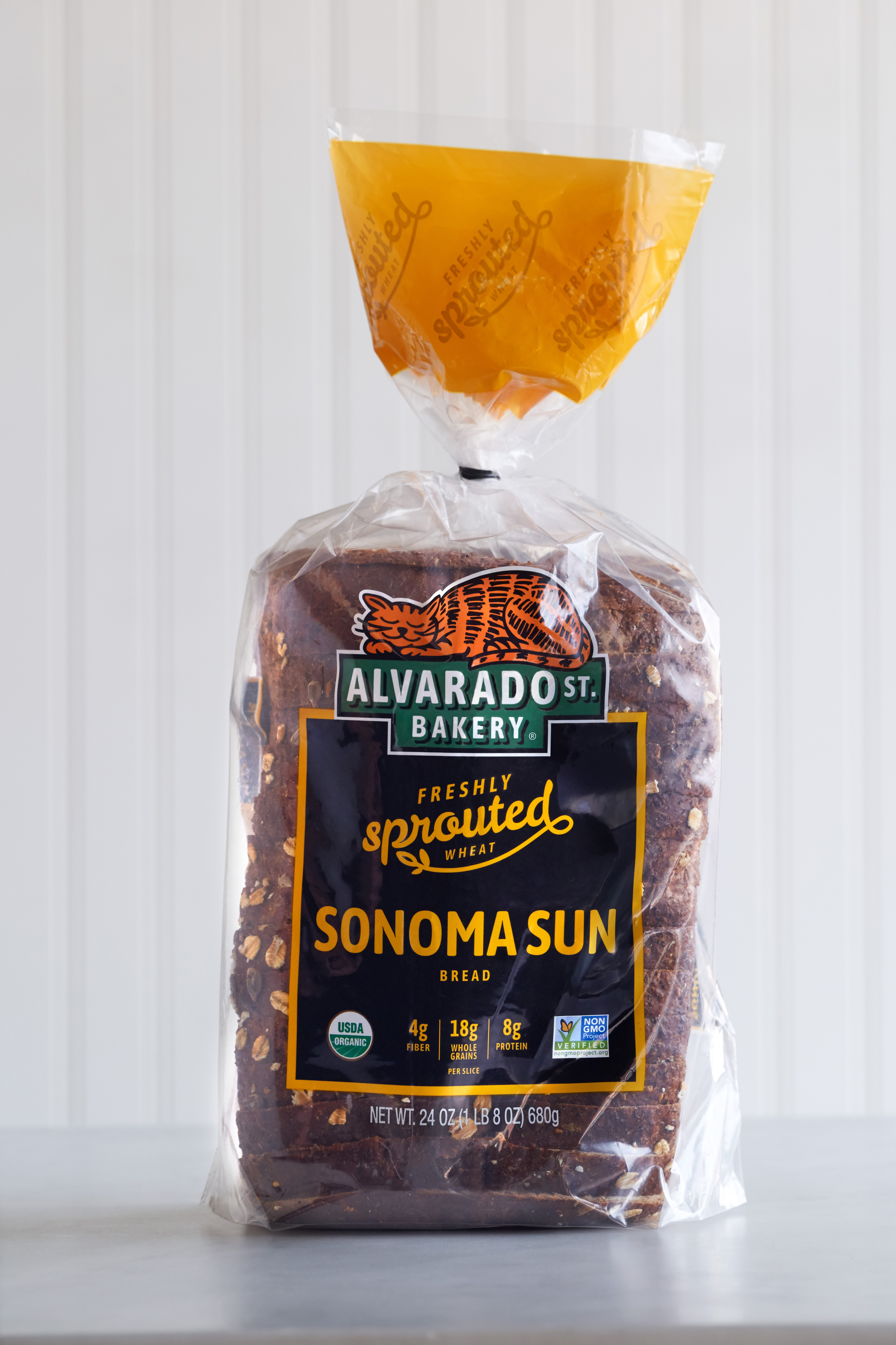
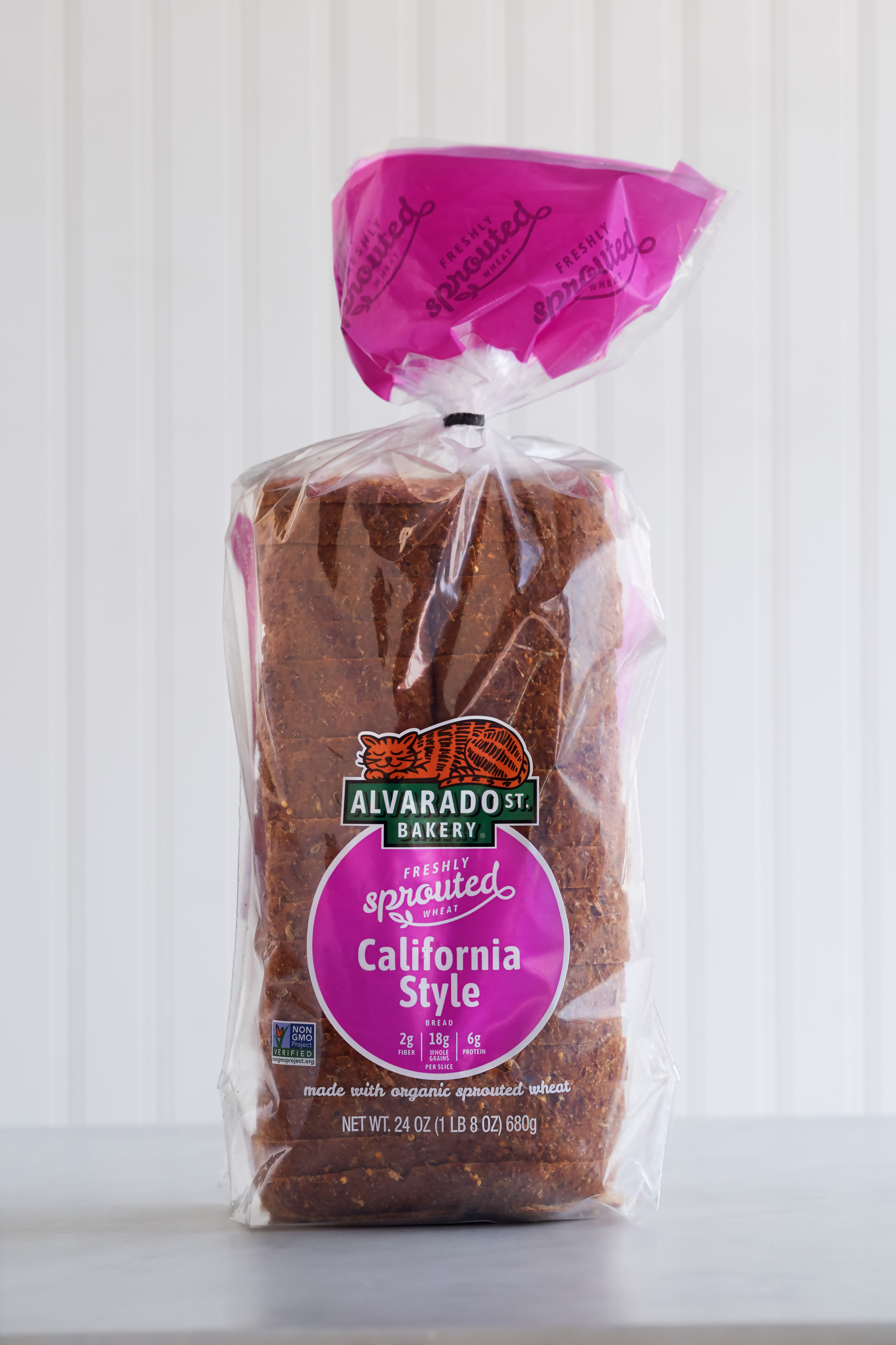
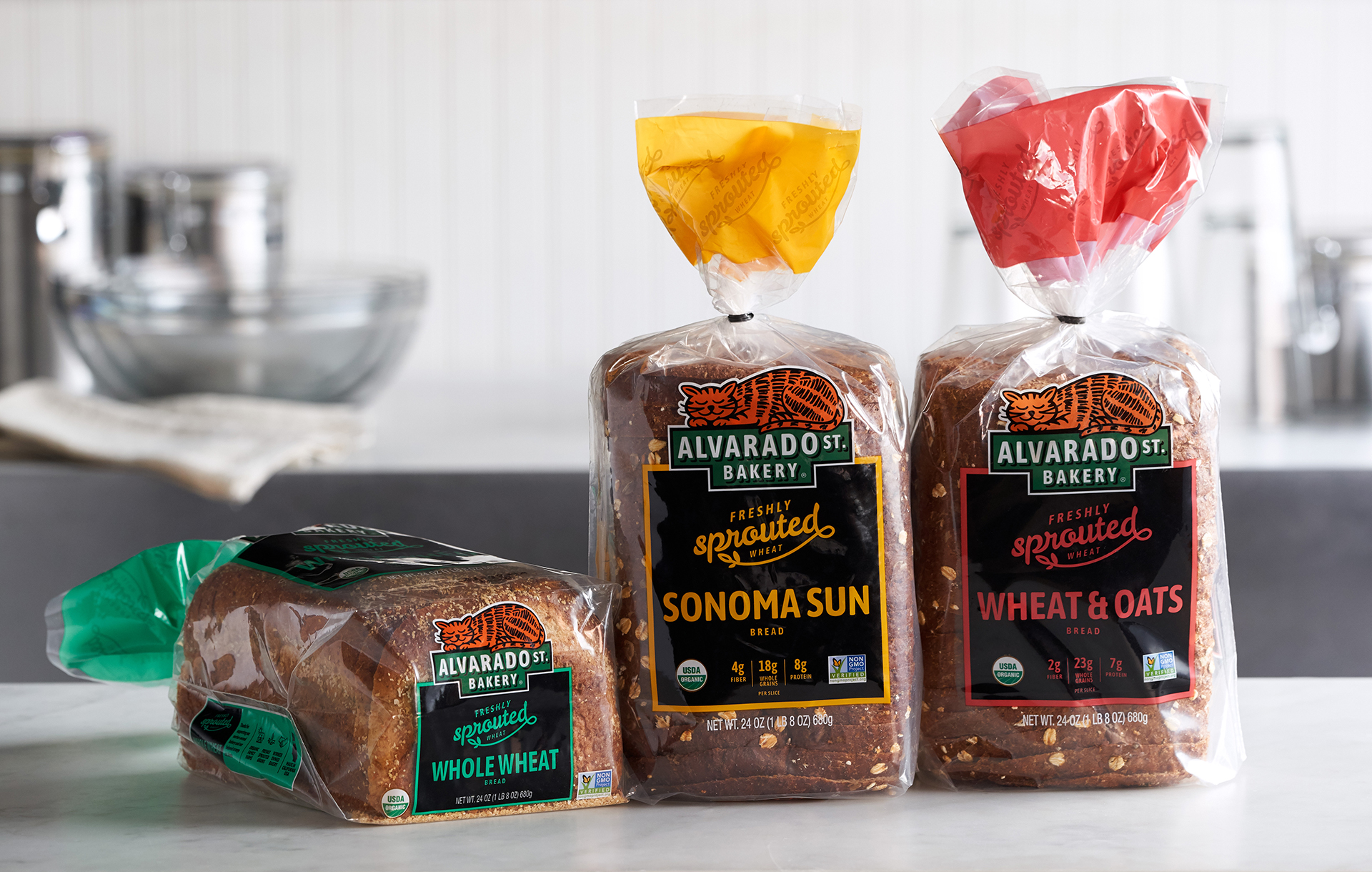
To create more effective brand communication, we redesigned the visual architecture of the packaging, prioritizing their proprietary brand identity while retaining consumer-recognized cues such as flavor colors. We refined the appearance of their beloved feline mascot, Greta, within their logo, enabling her to appear more prominently on the package. We also visually reinforced the brand name by revising the Alvarado Street Bakery logo to stage Greta on top of an “ALVARADO ST.” sign.
To create greater product differentiation, we recommended prominently featuring a unique process they use to create their doughs. Unlike other breads, Alvarado Street Bakery sprouts their wheat daily and folds the sprouts directly into their dough to create a more nutritious and delicious bread – a process we named “Freshly Sprouted.” We designed a proprietary “Freshly Sprouted” logo and positioned it in the center of the package, effectively turning a previous point of parity into a unique point of difference versus the rest of the category.


