In recent decades, aquaculture has sought to meet the demand for fish worldwide, but fish farming has led to negative environmental effects. In an effort to reverse this trend, Chilean-based AquaChile and DuPont partnered to improve fish farming standards. At the heart of their approach is a new diet for farmed salmon, which reduces dependence on wild-caught feeder fish by 75%.
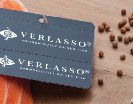
To create their brand, we established a strategic platform and named the company Verlasso—a hybrid of verdad, Panthalassa (the original super ocean), and archipelago. The brand identity and visual elements illustrate Verlasso’s advocacy role in the industry, while their website and collateral keep pace with PR outreach. The site also serves as a destination for aquaculture dialogue. Verlasso now has the industry presence they need to tell their story and promote long-term change.

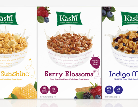
Our work with Kashi represents our most significant impact on positive change. For over a decade, we’ve been Kashi’s branding partner, together changing the landscape of healthy eating. In our time together, Kashi has grown sixfold and held the leadership position in the healthy lifestyle category. The relationship that began with a single snack brand has expanded into all aspects of brand strategy and architecture, innovation support, brand creation, naming, and package design.
Widening Kashi’s focus from product to overall lifestyle is our biggest achievement. To do this, we created a brand architecture to manage a master-brand strategy for their heritage line and formalized several key endorsed platforms such as healthy weight management (GOLEAN) and heart health (Heart to Heart). Snack bars, crackers, and cookies have contributed significantly to the brand portfolio, just as Kashi’s expansion to the frozen food aisle has helped fulfill their lifestyle promise. In this business, the most rewarding outcome of our work is a long-term client-agency relationship that seeks mutual benefit and clear business results. We have that in Kashi, a brand that is emulated by many but surpassed by none.

Shorenstein Hays Nederlander is one of the Bay Area’s preeminent theater companies. But after 30 years in business, the brand was not as visible as the productions they made possible. In order to build relationships with new and existing theatergoers, they had to enhance their national recognition.
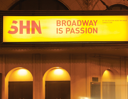
To help achieve their goal, we developed a brand platform that positioned the company as the curator of world-class Broadway in San Francisco. We also gave them a more contemporary monogram: SHN. A bold logo and graphic system revitalized their identity, while print advertising, web content, direct mail, a subscription campaign, and outdoor ads reinforced the brand’s promise. SHN has since enjoyed record subscription renewals and was chosen to be the Broadway programming partner for the Dallas Center for the Performing Arts.

Ariat International was founded to provide equestrian riders with technologically advanced footwear and apparel. Today, they are the top-selling brand of cowboy boots in the US. They wanted to evolve from a niche brand, which had focused on marketing to Western and English riders, to a cohesive equestrian lifestyle brand that would resonate with all riders.
We created “It’s Why I Ride,” a campaign platform that allowed all riders to tell stories of their unique bonds with their horses. The campaign appeared in retail signage, print, online and TV, culminating at Ariat’s sponsorship presence in the 2010 World Equestrian Games in Kentucky. The campaign and the brand’s presence during the World Equestrian Games has been hailed by Ariat management as their biggest marketing success in the company’s history.

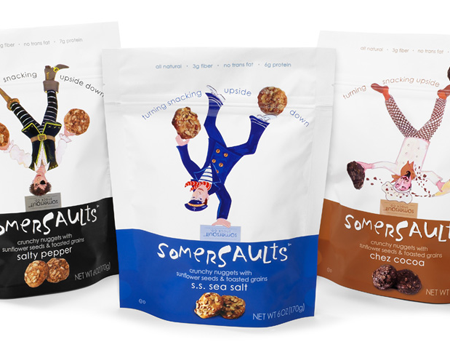
National Pretzel Holdings, owner of the HK Anderson brand of pretzels, set out to create a completely new snack product that would belong to a single parent brand. From product development to naming to package design, they engaged us in every step of their brand creation.
For our name development, we did a category audit, which pointed us in the direction of energetic names that appeal to adults as well as children. We began by focusing on fairy tales—stories for children with an adult message—as creative inspiration, which expanded into the larger concept of childhood pastimes and games. “Somersaults” captured a sense of playfulness while remaining complex enough to engage adults. The parent brand became Somersault Snack Co. Peet’s Coffee & Tea gave Somersaults a trial placement in their stores; today, Somersaults continues to fly off the shelves at Peet’s and in more than 700 other retail stores nationwide.

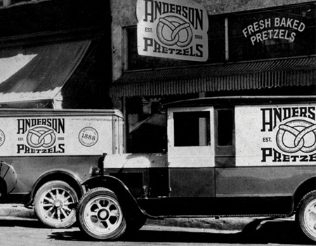
National Pretzel Holdings, a provider to private label brands, has its own brand called Anderson Pretzels. In spite of being more than a century old, Anderson Pretzels enjoyed very little brand recognition, owing in part to inconsistent design standards. National Pretzel came to us to help them increase Anderson’s brand recognition and compete with market leaders.
We conducted an extensive review of Anderson’s competition, as well as Anderson’s own line of products, to create a new brand platform. Anderson’s history of innovation was critical to the development of their brand strategy and essence, “Idyllic Nostalgia.” The brand name was changed to H.K. Anderson to convey a sense of heritage, and their new brand essence helped guide the redesign of their logo and packaging. A flexible, cohesive visual system ensures the brand can extend to a number of packaging structures, and verbal branding helps connect consumers to the brand’s tradition. The revitalized H.K. Anderson brand was very positively received by retailers leading up to its acquisition by a major national food company in 2011.

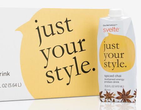
California Natural Products, an organic ingredient supplier, came to us when they were ready to launch their first consumer brand, a natural protein shake named Svelte. Entering a category already crowded with fortified teas, smoothies, sports drinks, and meal replacements meant Svelte had to make a big impression.
To help ensure their success, we created an identity and packaging that communicates to busy, health-conscious women seeking nutrition on the go. Product cases provide a canvas on which to reinforce brand messages. Since Svelte’s launch, the packaging has become very popular with consumers; it was also recognized by AIGA for outstanding print design in 2010. Svelte is now on the shelves of grocery stores like Whole Foods, as well as health clubs across the US, where it “speaks” encouragingly to health-conscious consumers.

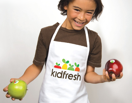
Every parent wants an easy way to prepare healthy, fresh meals their kids will enjoy. For our client, this was the beginning of a brand idea: a grocery store dedicated to kids’ nutritional needs and parents’ peace of mind. Kidfresh sought our help to define a new category and prepare them for future competition. Using a bold, graphic design system that appeals to the affluent urban moms, we presented Kidfresh as a healthy and fun food store for children and a new lifestyle brand for the whole family.
The launch of the Kidfresh grocery store in New York and online proved to be a big hit. With appearances on CBS, NBC, and The Today Show, Kidfresh has gained recognition and become an essential part of the day for families. The brand has since expanded to include classes, catering, and airport distribution.

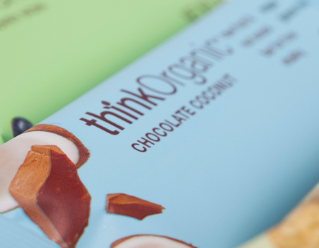
Think Bar wanted to rejuvenate their brand, which was feeling the impact of changing dietary patterns. The products were great, and the ingredients were top-notch, but nothing seemed to be working. To reposition them, we came up with this key truth: consumers want a simple, holistic solution that inspires them on their journey towards better health. Think Bar had to pay more attention to this emotional benefit; no other brands appeared to be effectively positioning themselves as performance-based with a holistic benefit.
We made the food the hero and built a masterbrand strategy around the concept of true vitality. This also served as the driver for the clean, vibrant redesign that clarified and unified all aspects of the brand. The new brand tells the unique story of an entrepreneurial company that is making the world a healthier place, one bar at a time.

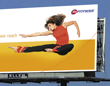
When 24 Hour Fitness came to us, the fitness category was known for high employee and client turnover. While 97% of Americans said fitness is important, only 12% worked out regularly. In response, 24 Hour Fitness sought to revitalize their communications, improve their brand expression, and create a more inclusive brand ethos.
We recast 24 Hour Fitness as the brand that enables clients to “live better,” emphasizing the benefits one hour of exercise brings to the other 23 hours in the day. The corresponding visual design featured a foreground image and a background “tile” pattern to evoke a calendar. We also recommended that the company reward staff for membership renewals to promote ongoing relationships. The new brand strategy resulted in lower attrition of both clients and employees—and a highly successful sale of the business.


