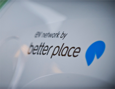
We positioned Better Place as a mission to deliver the world from its dependence on oil-based transportation. While the business model proved unsuccessful, our branding work succeeded in establishing a powerful stature and voice for the brand, resulting in securing over $800M in venture funding.
The company’s goal was to build the infrastructure and partnerships for the deployment of zero-emission electric vehicles worldwide. We simplified a complex story by framing the solution as simply switching from the pump to the plug.
Our logo represents the transformation to an optimistic blue planet, while our brand videos, social media campaign, and integrated identity system captured the imagination of a world hungry for such solutions.
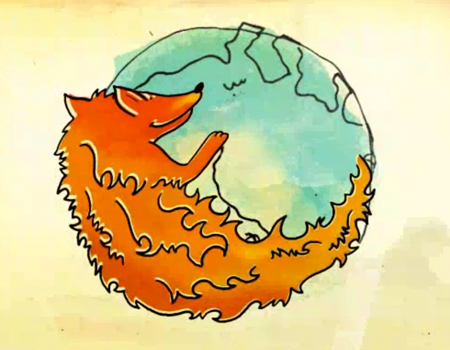
We are proud to have partnered with the Mozilla in creating and producing “The Story of Firefox,” which celebrated their commitment to the Web as a living, growing ecology of vibrant ideas, developed for everyone, by everyone.
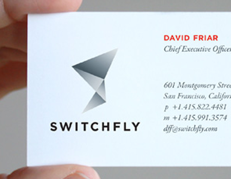
San Francisco-based Switchfly (formerly ezRez) provides a single technology platform for travel and rewards products under their clients’ brand names. Companies like United Airlines are able to easily share information—like customer segments and pricing—between their own products to optimize conversion rates. But most importantly, the experience for their customers is continuous and seamless.
As Switchfly planned to expand their services, they knew they had to evolve their brand. We helped them define their brand platform and broader mission: engineering rewarding experiences. The name “Switchfly” captures their travel heritage and ability to “switch on” possibility, while a stylized “S” in their visual identity conveys adaptive precision. The revitalized brand has been well received and has helped them secure funding for continued growth.
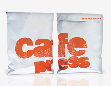
CafePress is a leader in online user-generated commerce. The website hosts products designed by users, while CafePress provides the ecommerce platform. The site also allows buyers to shop for or create something unique for themselves. After a decade in the market, CafePress wanted to make sure they still had a relevant brand strategy and corresponding identity.
We began with a visual exercise for the brand platform, which established clear parameters for the new identity. The textured logo we created reflects the hands-on, spontaneous nature of self-expression; a robust color palette and friendly icons capture the vitality of the community. We also created a sustainable packaging guideline with goals, targets, and processes for production. CafePress was so pleased with the new brand identity, they created a video from our brand story to share the experience.
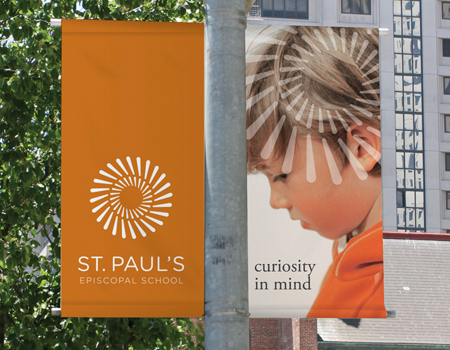
Located in Oakland, California, St. Paul’s is a private K-8 school founded on the belief that students from diverse backgrounds can learn better in collaboration with each other. When other area schools began to promote a similar message, St. Paul’s began to experience a drop in interest and enrollment.
We met with students, faculty, staff, parents, and alumni to understand the school’s opportunities. Many parents found St. Paul’s urban setting intimidating, and some expressed concern about academic quality. But the school’s achievements spoke for themselves. By placing curriculum, diversity, and urban setting on equal footing, we defined St. Paul’s as a “learning village,” which extended to their identity and verbal expression. The new brand platform helped the school exceed their enrollment forecast and outperform peer schools in student matriculation.
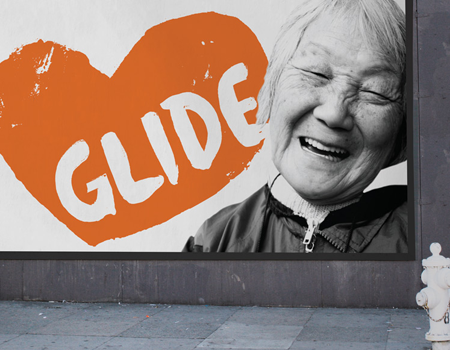
Under the leadership of Reverend Cecil Williams and Janice Mirikitani, San Francisco-based GLIDE has supported and uplifted disenfranchised people for decades. We were tasked with evolving their brand to better reflect the organization’s mission, vision, and personality. Following in-depth research, we developed a brand platform with the unique promise, “celebrate humanity to inspire social change.” The corresponding visual identity captures GLIDE’s unconditional love for all, the feel of the surrounding neighborhood, and the uncomplicated power of their promise. The new tagline “Unconditionally,” reinforces the idea of community.
To increase fundraising, we refreshed GLIDE’s primary website and launched their first Facebook application. Our work helped ignite interest in volunteering and donating, with a 15% increase in website traffic and a strong 2010 fundraising season.
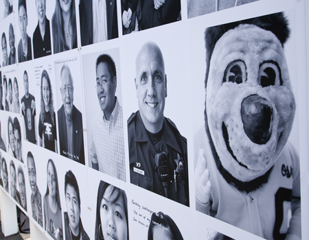
As UC Berkeley prepared for an ambitious fundraising campaign, they struggled with the familiar challenge of creating a “culture of giving and gratitude.” University Relations engaged us to develop a theme for the campaign that would bring a fresh perspective and motivate new and current donors.
In dozens of interviews, we mined for the true meaning of UC Berkeley, which led us to an unexpected conclusion: to stereotype the university was to miss the anti-brand hero it symbolizes. Students graduate with an exceptional education, but also with a strong sense of self. We created a platform where everyone touched by UC Berkeley could tell their story, starting with “Thanks to Berkeley…”. The theme inspired a photo booth project, where hundreds of portraits were displayed with their accompanying stories. The installation marked the successful kickoff of the public campaign which ultimately exceed its goal of $3 billion.
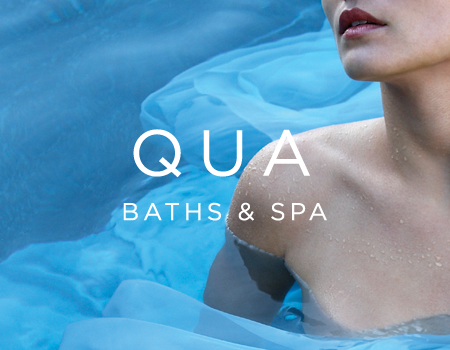
Faced with a revitalized Las Vegas hospitality scene, Caesars Palace decided to undergo its own renewal. Their flagship property, the Augustus Tower, was home to a new 50,000-square-foot spa which they wanted to become a coveted destination and key brand differentiator. A series of modern Roman baths would be the focal point of the location.
To create a spa brand that would elevate Caesars and be appropriate for properties worldwide, we reimagined the concept of spa, starting with a brand platform that promised a uniquely immersive experience. We named the brand Qua, meaning “here” in Italian and evocative of “aqua,” or water. The brand’s identity symbolizes the three pools of traditional Roman baths, and brand visuals depict the graceful effects of water. Qua Baths & Spa opened to great fanfare; in its first year, it was named a top ten US spa.
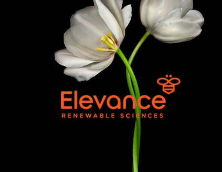
Texas Pacific Group asked us to develop a brand for a new company that offers renewable alternatives to the petroleum found in cosmetics, candles, and other products. The company is changing how products are made, but more importantly, they are changing their industry’s future and consumers’ lives for the better.
We began by developing a brand strategy that expressed optimism and a sense of higher purpose. This inspired the brand name Elevance, as well as a descriptor for the new category: “Renewable Sciences.” The company’s brand identity includes a bee symbol to represent innovation, teamwork, and productivity. And like bees, Elevance uses nature’s own compounds to create something new without depleting the source. The company’s founding CEO said our work was invaluable in helping her establish the meaning of their brand in an everyday context.
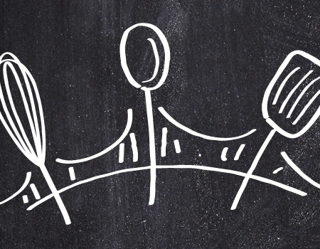
We created this brand for Valley Fine Foods from the ground up. A new line of refrigerated chef-inspired pastas, sauces and meals, Three Bridges is the brand that brings chef-crafted recipes to everyday meal planning. The name evokes a sense of place, diversity, and of coming together. Its chalkboard visual metaphor gives the brand the immediacy of a fresh meal at your favorite bistro. Three Bridges enables today’s busy families to consistently prepare a wide range of delicious and nutritious meals simply by stopping at their grocery’s refrigerated section.
We integrated the brand image by leveraging the design system in package design, website design, and throughout the brand’s touchpoints. The overriding brand strategy is a focus on freshness and good living and the brand image reinforces that strategy throughout.